
Goodnotes
Role Senior Product Designer
I was part of Goodnotes' toolbar team. Our mission was to elevate the toolbar Quality of Life to the next level. So when we found out some of its most important tools settings were basically invisible, it wasn't a small thing to fix. It was close to the heart of the whole product experience.
The Problem: An unusual pattern
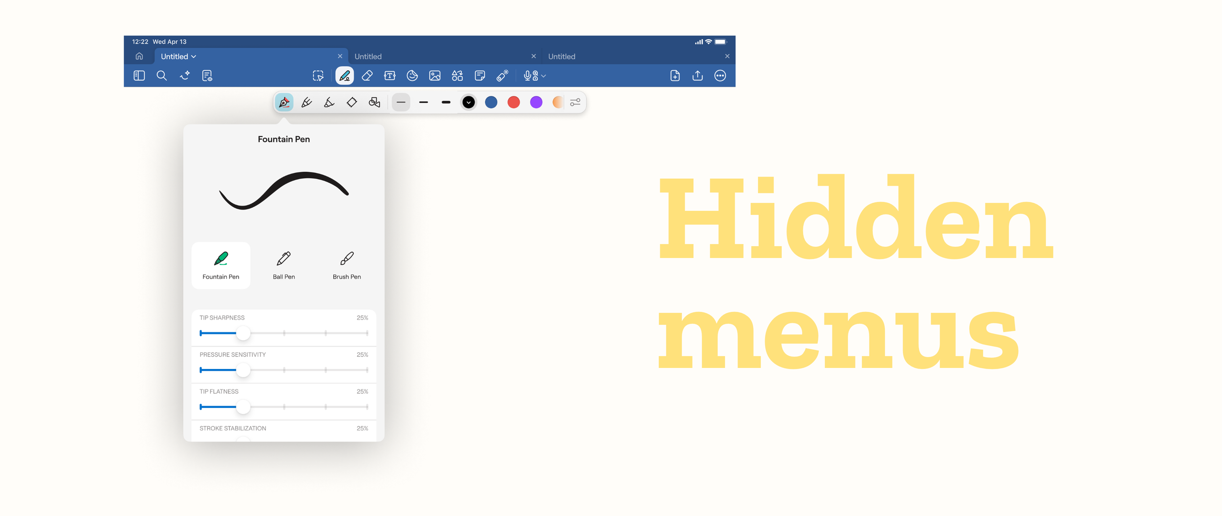
Some tools in the toolbar have settings hiding behind a second tap, which by itself is an unusual pattern. Once a button is active, people don't expect to be able to click on it again.
There was also no UI indication of which tools have settings behind a second tap and which don't.
To make matters even worse, it affected our top using tools:
Writing tools - which are the whole point of Goodnotes.
Lasso tool - which is used to select things.
It also affected the Laser Pointer, which has fewer users overall but matters a lot to teachers, one of our most important groups.
Avoiding past mistakes
Goodnotes is a rich feature product and as such suffers from one common problem: discoverability.
In the last few years Goodnotes design team has tried to solve this issue with the most common solution: red dots and coach marks. Soon we discovered that these solutions can quickly clutter the user experience. Plus they don't necessarily solve the problem, when bad applied, they just push the problem to user's cognitive load.
I wasn't willing to fall victim of the same trap. I wanted a long lasting true solution.
The Plan
Study the current toolbar architecture
Learn it's architecture
Identify it's flaws
Talk with past toolbar designers to understand past design decisions
Benchmarking
Explore solutions that play with the IA
Share early to gather feedback
Iterate based on feedback
Handoff designs
Align on how to validate success
Give support where needed
A/B test chosen solution with new users
Iterate if needed
Release final design to all users
Identifying structural problems
One of the solutions was to use the secondary menu pattern we already had elsewhere in the toolbar, and just make it visible for these tools too.
Two of the stakeholders didn't agree with that direction. They couldn't fully explain why, just that it didn't fit their mental model. The other stakeholder and I disagreed with their opinion. So I realised we had a serious structural problem: there wasn't an official mental modal for the toolbar.
I raised this problem and proposed to focus on the discoverability issue for now, since it had a known impact in the user experience. As soon as we solved this, we agreed to tackle the toolbar mental modal.
But what actually changed my mind regarding this solution wasn't the disagreement. It was realizing the idea didn't scale: the same hidden-settings problem existed inside those secondary menus too. To follow this approach would mean finding yet another way to make settings for tools in the secondary menu discoverable. Two solutions for the same problem, instead of just one.
The solution
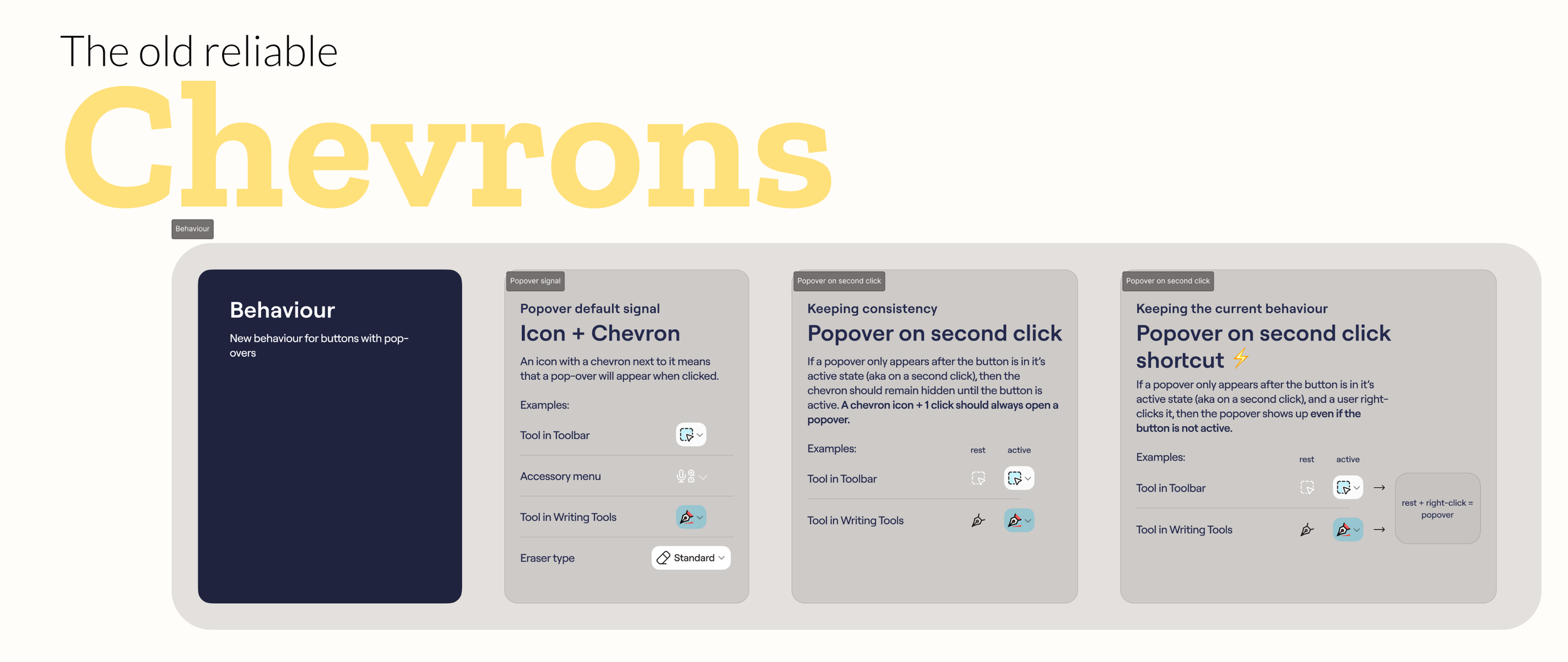
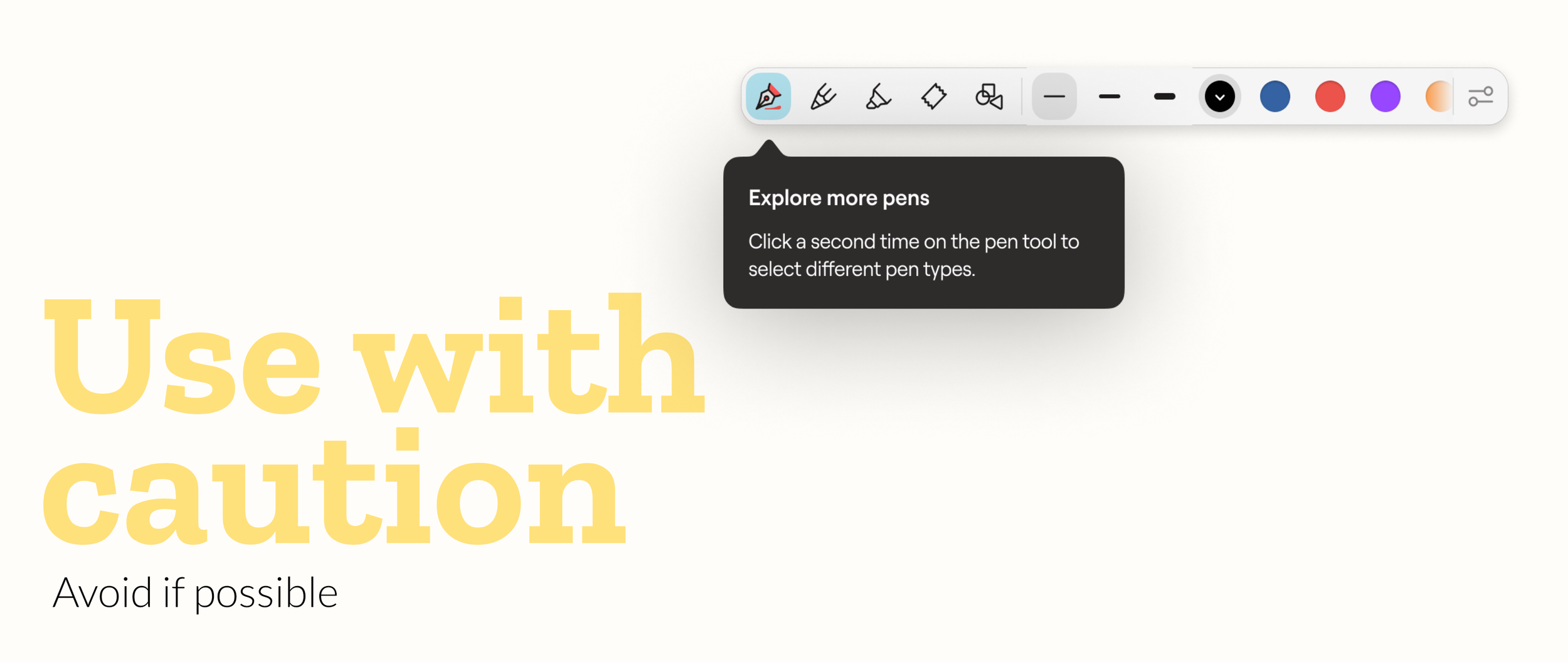
What I landed on was a simple solution: a small chevron next to any tool that had a secondary menu behind it's active state.
This solution was not just simple. It was also scalable. It could be easily applied to any tool, no matter the menu level.
But getting the timing of the chevron appearance was essential due two reasons:
First, space. The toolbar menus were already busy, adding chevrons to every relevant tool would've made things feel cluttered in an area with no room to spare.
Second, meaning: a chevron usually means "tap this and something opens right away." That's not how this worked. You had to activate the tool first, then tap again to trigger the menu. Showing the chevron too early would have promised the wrong thing.
Making It Feel Right

Having the chevron appear the moment a tool became active felt abrupt. What could I do to smooth things out? The answer: a small press animation. Icons shrink slightly on press, and grow back on release. It's a familiar kind of interaction, the sort you see in a lot of other products, just not one Goodnotes had before.
I applied it to every button in the toolbar, not only the ones with a chevron, so it wouldn't feel like a one-off effect stuck onto a few icons. For the tools with a secondary menu, that same release also nudges the icon slightly to the left while the chevron grows in and moves to the right.
Because every button now moved the same way, the chevron felt like part of something consistent, not something new appearing out of nowhere.
Testing it
Lasso tool and Writing tools are used by all of our users, so this wasn't something we could just ship and hope for the best. We ran an A/B test and rolled it out slowly, watching results before going further.
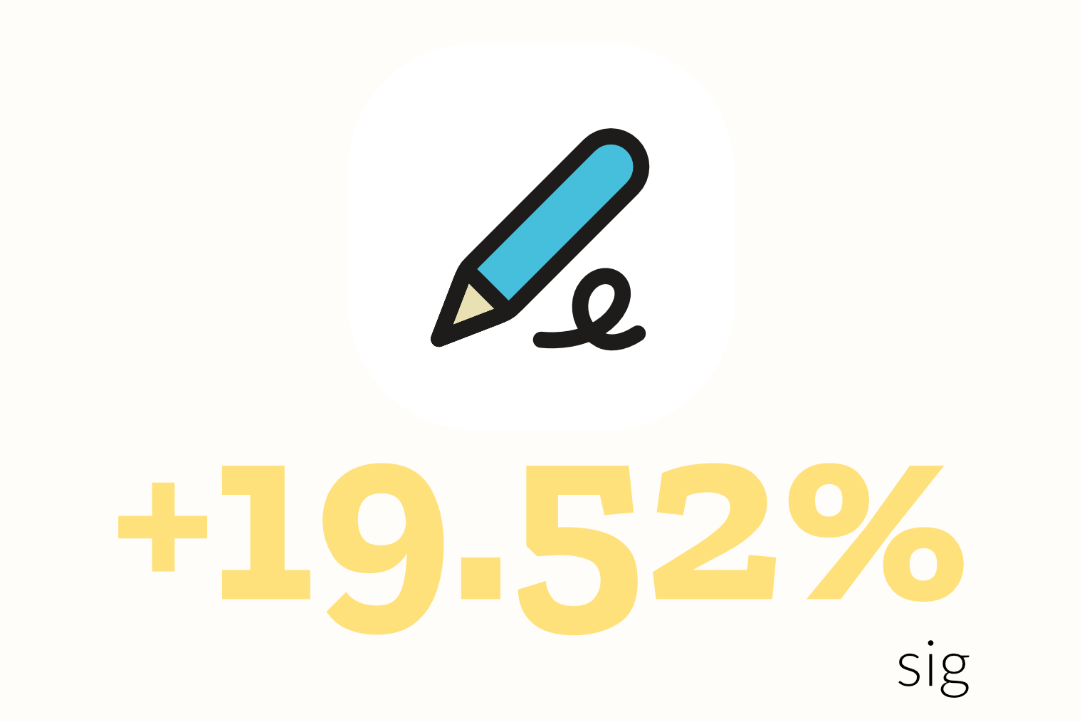
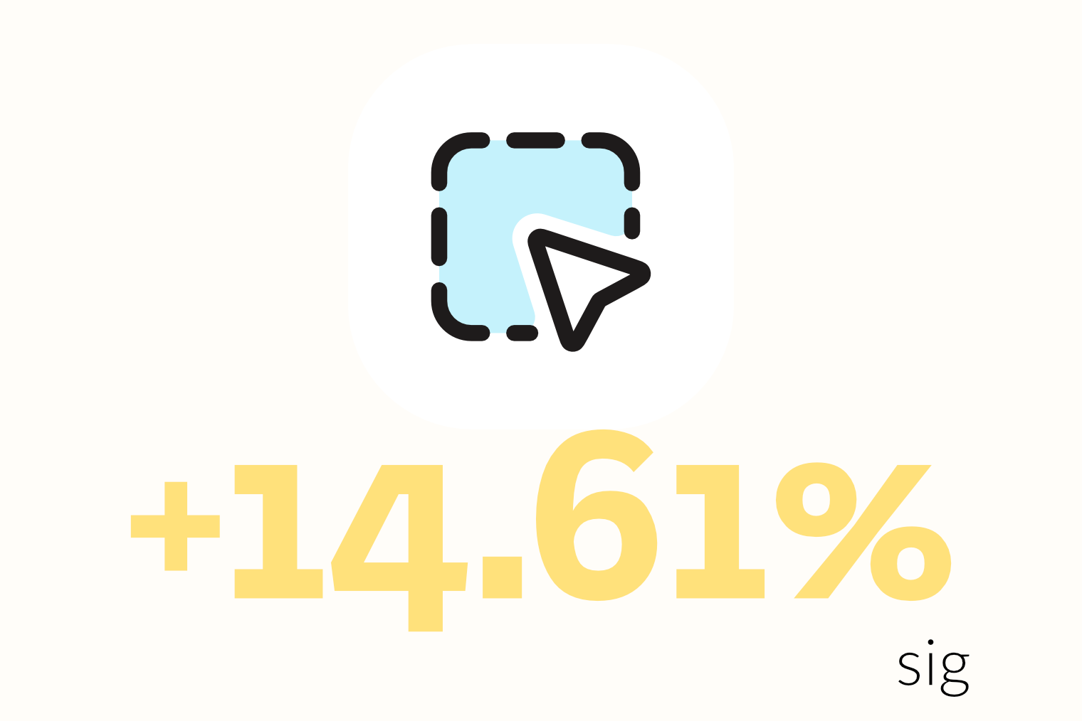
Data showed that, thanks to the chevrons, tool's settings interaction went up. Indicating a clear product quality improvement. So we decided to release it to all users.
Writing Tool Setting
Lasso Setting
Laser Pointer Setting
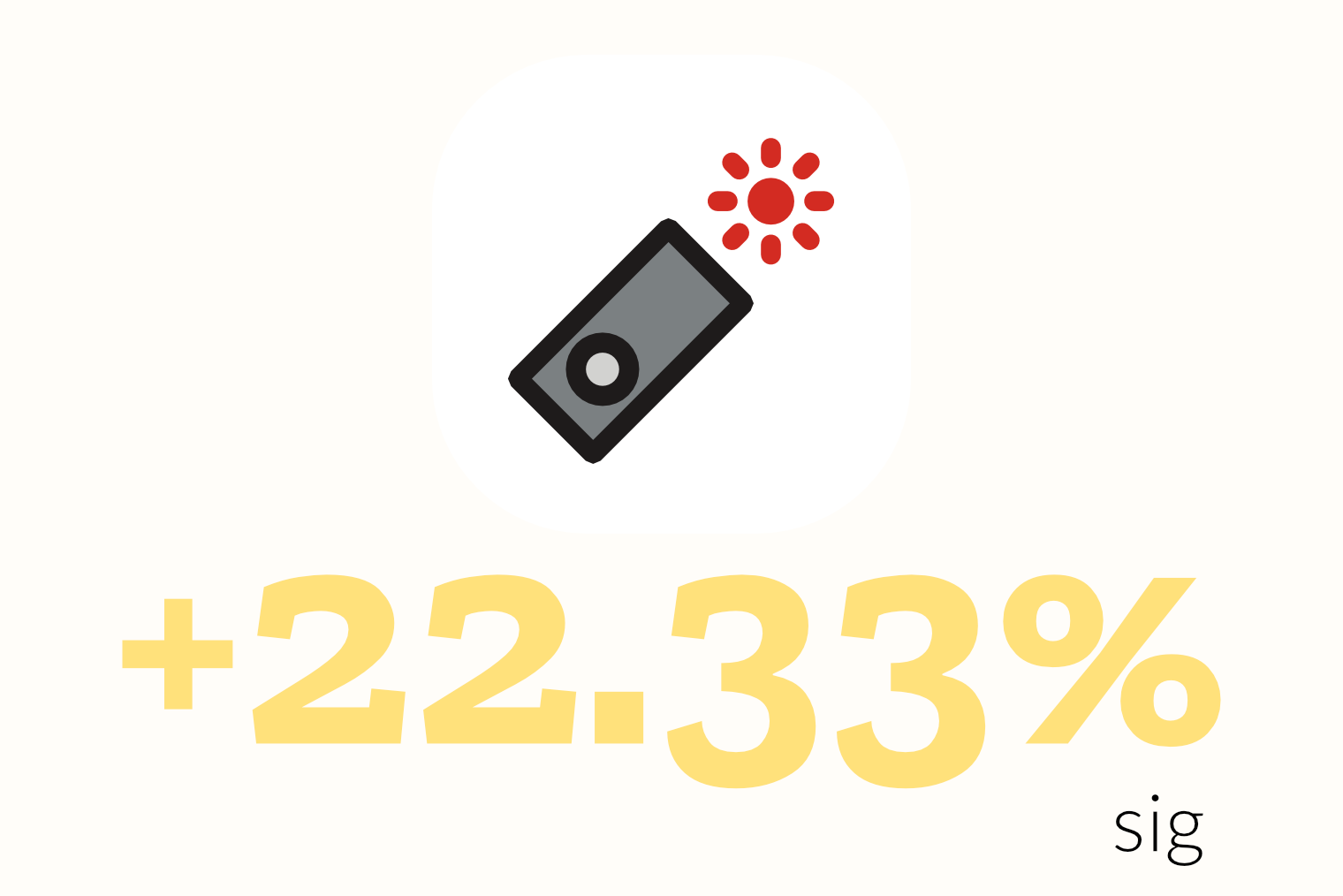
sig = statistical significance
Final thoughts
Toolbar mental modal
What I Learned
Unfortunately, before we could revisit it, a reorg moved the toolbar out of our team scope entirely. I flagged the open thread to the designer who took over, so at least it wasn't just dropped. I would have loved to close that loop myself. It was a complex and excited challenge, and I was more than ready to tackle it.
This project is where the scalability lesson really stuck for me: a fix that only solves the case in front of you isn't a fix, it's a delay. Since then, I catch myself asking one extra question before committing to a direction: where else does this same problem show up, and will this hold up there too? It's a small habit, but it's changed how I approach almost everything I design now.
Want to learn more about Goodnotes discoverability challenges and solutions? I’m one message away 😉